
Phoebe
Mobile Design, Product Design
Sept 2023 - Feb 2024
Interaction/UX Designer

Overview
The Phoebe app is a highly interactive language-learning platform for young adults. The ultimate goal of the app is to integrate the digital experience into fun, engaging education through AR, stories, games, and more. Phoebe is designed to serve as a dynamic journey for users who stay current with digital trends (i.e. Gen-Z) and need a more immersive relationship with a product to stay involved.
Problem
Traditional language learning methods often lack engagement for our target audience, leading to inconsistency and disinterest. Phoebe addresses these issues by providing an interactive platform that aligns with the preferences and habits of young adults, making language learning both enjoyable and effective.
Initial Research
Through my initial research, I was able to learn from 3 separate studies from the last 5 years that highlighted the positive impact of digital language learning - 2 of which focused on younger users.
...and my findings
1. Online learning environments widely allow young people to connect to new perspectives and express themselves more freely. (Muszyńska and Geisler, 2023) 2. Language-learning apps are more popular with younger audiences because of their typical familiarity with digital interactivity. (Bećirović, 2021) 3. Because more screen time can equate to shorter attention spans, online learners are growing rapidly more disinterested in traditional learning experiences. (Song and Xiong, 2023)
Persona
To help maintain my focus on the target audience throughout the design process, I created a user persona that served as an example customer but also helped represent many of Phoebe's target users with similar goals and pain points.

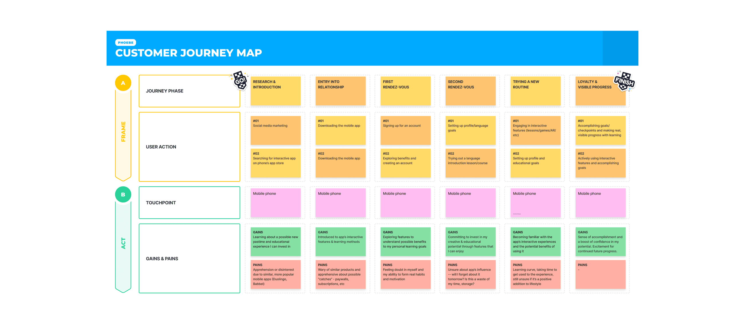
Customer Journey Map
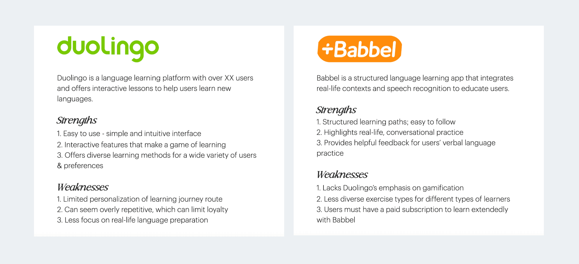
Analyzing Top Competitors
Design System
In developing the design system for Phoebe, I aimed to capture the brand essence I'd envisioned in every detail. Drawing from user insights and cultural cues, I carefully selected vibrant colors and readable typography. From crafting icons to refining UI components, every element was thoughtfully considered to ensure a cohesive and delightful user experience that could grow with its audience.

Sketches
Before building digital wireframes, I brainstormed different versions of each key screen on paper. I tend to also annotate my paper sketches with new ideas, reminders, important details, and solutions that feel like a good fit.

Low-Fidelity
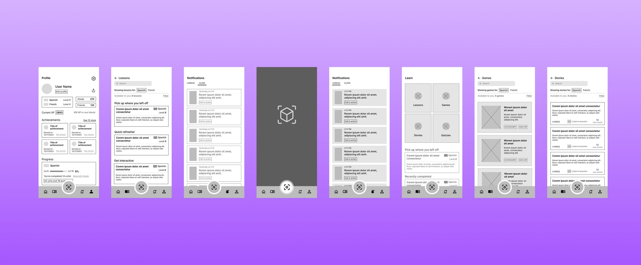
Next, I digitized the key user flows in Figma, referencing Apple's Human Interface Guidelines to ensure accessibility and responsiveness. Low-fidelity wireframes were then transitioned to mid-fidelity wireframes, which included a working prototype formatted for testing with essential details and CTAs to move through the flow.
Usability Testing
To test the accessibility and functionality of the mid-fidelity prototype, I conducted an unmoderated usability study with 6 participants in Phoebe’s target demographic. Each of them were avid smartphone users and reported feeling comfortable exploring new mobile experiences. The participants were directed to complete a list of tasks using the prototype that tested the User Profile flow, AR Discovery experience, and the interactive learning features.
Findings & Iterations
Several key insights stood out from the usability test: 4/6 participants found the profile screen overwhelming and disorganized. 3/6 participants found the AR discovery feature difficult to use. 3/6 participants agreed that the interactive features did not feel engaging or distinct. After studying the insights I’d drawn, I was able to set a few key statements about the design: 1. The profile screen should be less cluttered in order to provide a clear & motivating user experience. 2. Many users will need more clarification in order to successfully use the AR discovery feature. Augmented experiences aren’t familiar enough yet to be automatically understood. 3. The learning features (stories, games, quizzes) need to feel distinct and separate for the user to automatically differentiate them and have a fully immersive experience.
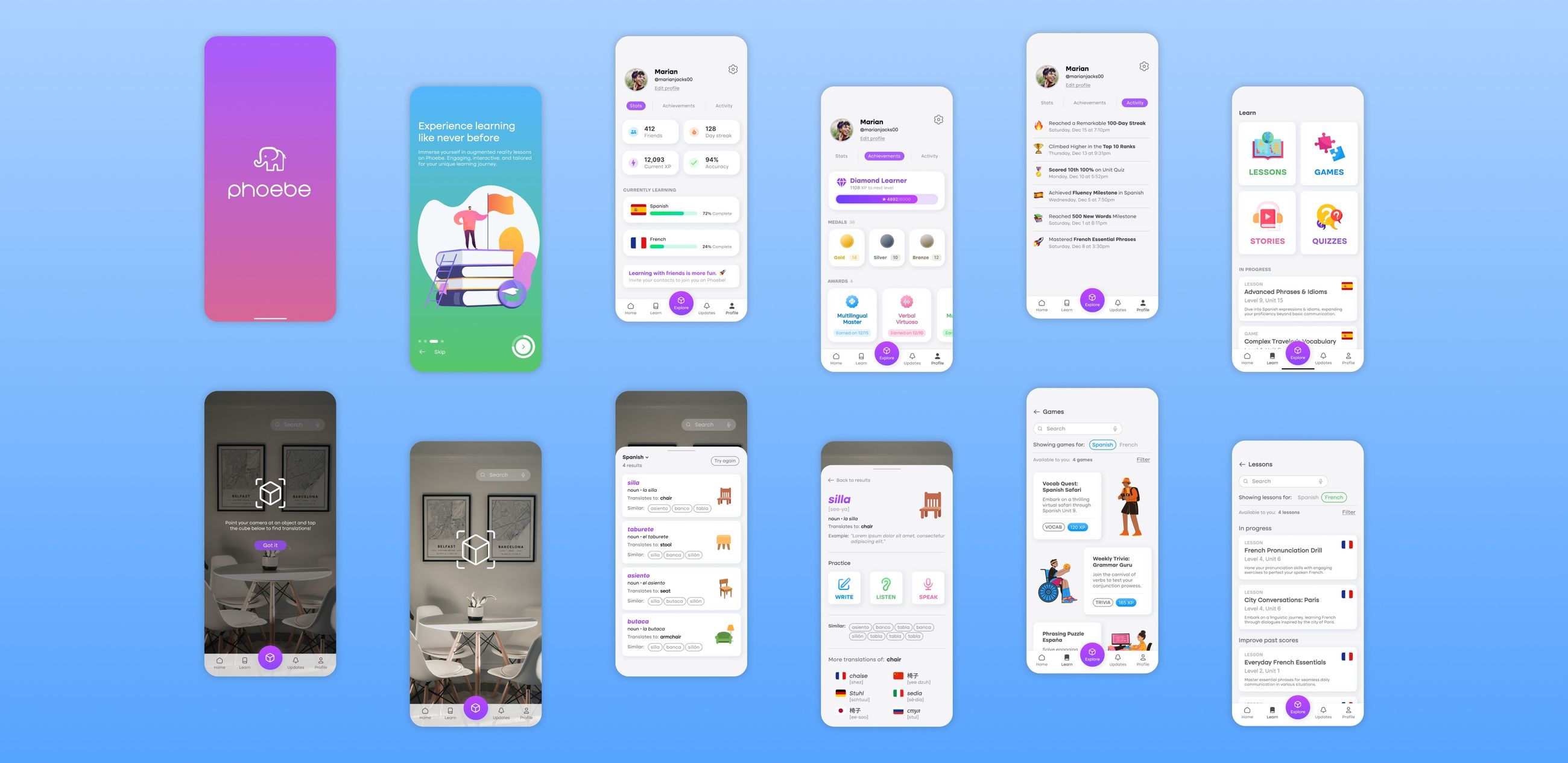
High-Fidelity
Once I’d resolved each key design issue, I transitioned the mid-fidelity screens into high-fidelity mockups.
Lessons & Learnings
Completing this personal project helped me develop my design skills further and allowed me to learn from each mistake. I often struggled with auto-layout in Figma before (and during) the project, but through trial-and-error, I was able to develop more familiarity with it. I also grew much more comfortable with creative UI design strategies, since I spent lots of time learning from other designers whose work I admired. If I were to continue this project, or if it were for an existing product, I would follow up this process by conducting a few more usability studies to improve the experience. I’d also go over my work carefully to ensure that the final prototype was ready to handoff to developers and optimized to make the development process as straightforward as possible.