Constellaire
UI/UX Design, Responsive Design
April 2024 - January 2025
UI/UX Designer
Introduction
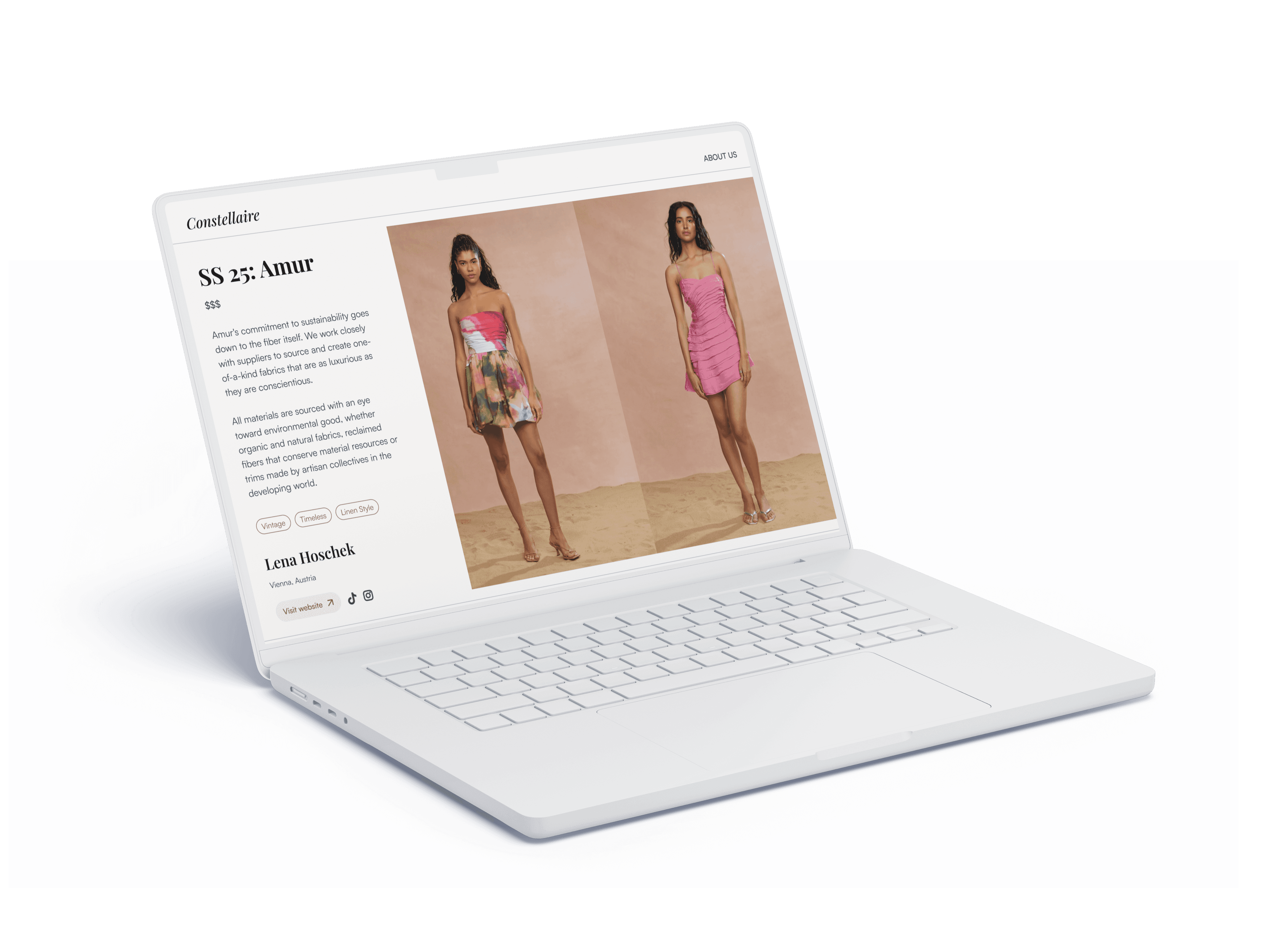
In March, I was contacted by a software developer looking to build a product that would make ethical shopping easier for consumers. They had several brands interested in the concept, and wanted high-fidelity mockups of the key pages to show interested parties before building out the product so the promise of the design could prove worthy before investing the time and money to develop the website.
Responsibilities
As the UX designer hired for to conceptualize the design, I was tasked with creating high-fidelity mockups for the following pages: • Home/Search • Brand Profile and Overview • Brand Lookbook • User Profile • User Wishlist The client and I split the process into three sections: Low-Fidelity Wireframes, Design System, and High-Fidelity Mockups. Each section was given a three-week timeline to plan for the mockups to be ready within two months from the start of the project.
Wireframes
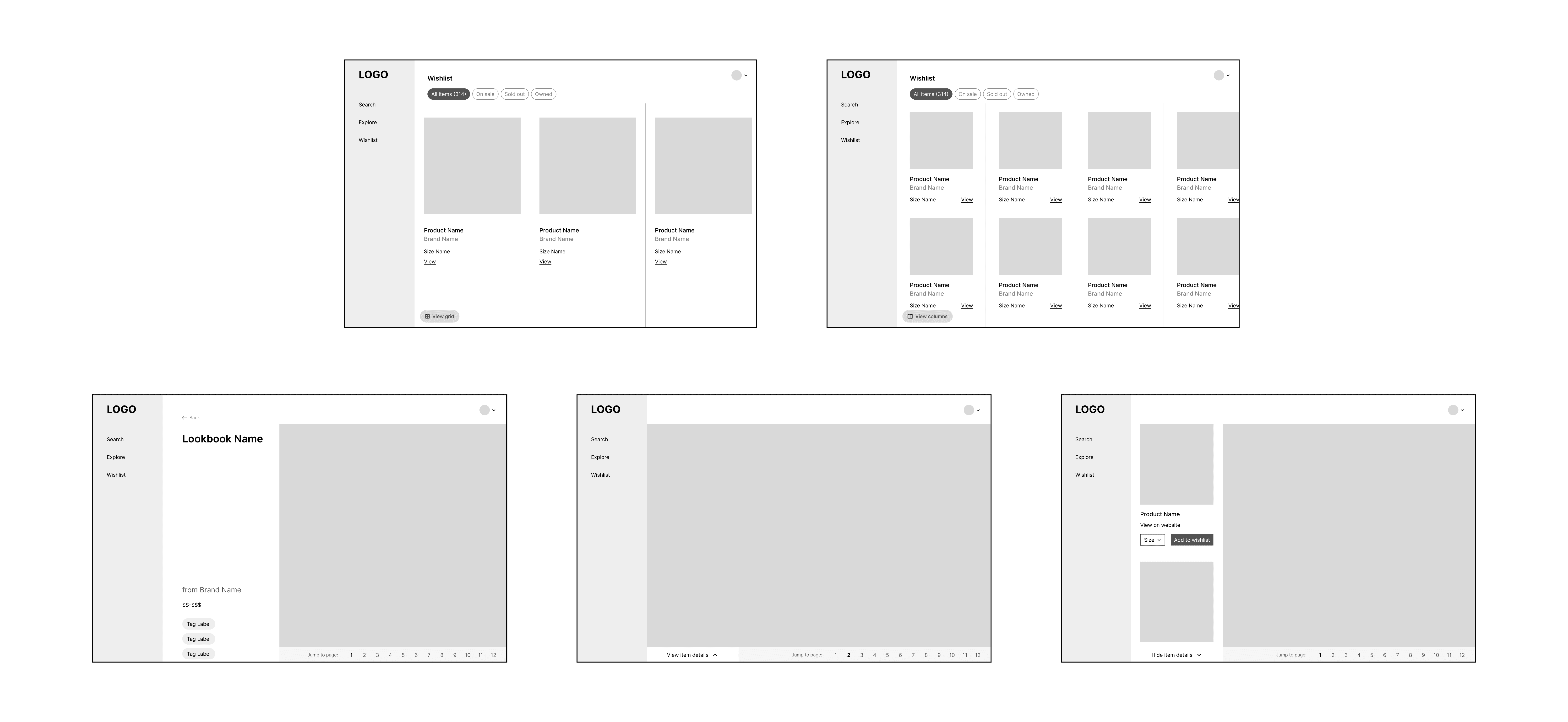
Throughout the three weeks that we spent focusing on the wireframes, my client and I had many Zoom calls to stay on the same page. Their priority for this entire project was this first stage, since they wanted to start building the structure of the platform referencing the wireframes even before the high-fidelity mockups were completed. One thing my client was particular about was their preference for a horizontal experience on key pages like the Lookbook and Wishlist. They were looking to offer users an immersive experience when discovering new items, brands, and collections. Prior to this project, horizontal scrolling was mostly unfamiliar to me, so finding the ideal layout and structure for this preference was a trial-and-error.

Iteration & Improvement
While building the low-fi wireframes, I decided to create reusable components for frequent layouts in order to maintain consistency. Since my client would be coding these elements after the wireframes were finished, they needed consistent, organized layouts even in the early stages, which required more focus on small spacing/sizing details than a usual low-fidelity phase might have. Additionally, the layout of the lookbook previews required multiple iterations. I'd originally designed these elements to have a more boxed-in layout, where the lookbook thumbnail image was contained inside a card with larger left and right margins. Since the goal for Constellaire was to offer an immersive, engaging experience, my client wanted a full-width layout for these previews. This would ideally intrigue the user right from the explore or brand profile pages, and would generate more interest in clicking through to the collections themselves.
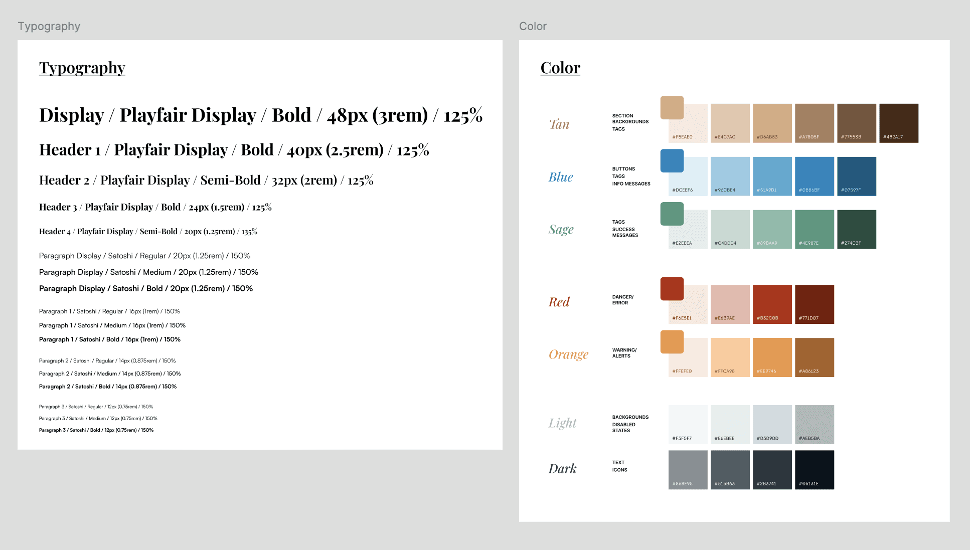
Design System