
Atomic Design System
Branding, Design Systems
April 2024
Role: Sole UX/UI Designer
Overview
In February of 2024, I decided to start building a UX blog that I'd wanted to run for a long time. After spending the last six months obsessing over Webflow, I finally felt comfortable enough with the software to approach a more complex project like a design blog. The blog itself, UXGems, is still being developed -- I'm looking to launch the site by the end of July. There will definitely be a case study added once I do, and I'm looking forward to running an active UX blog! I built the design system for UXGems in Figma after planning its structure and content. The library itself took enough time and focus that I think it needed a case study of its own. I'd worked with design systems before, and thoroughly enjoy them, but didn't fully immerse myself in them until this particular project. I'm continuing to expand this design system as needed, but the original file took about 50 hours to put together. After doing research, I chose to organize it based on the principles of atomic design, which massively influenced the quality and structure in the best way.
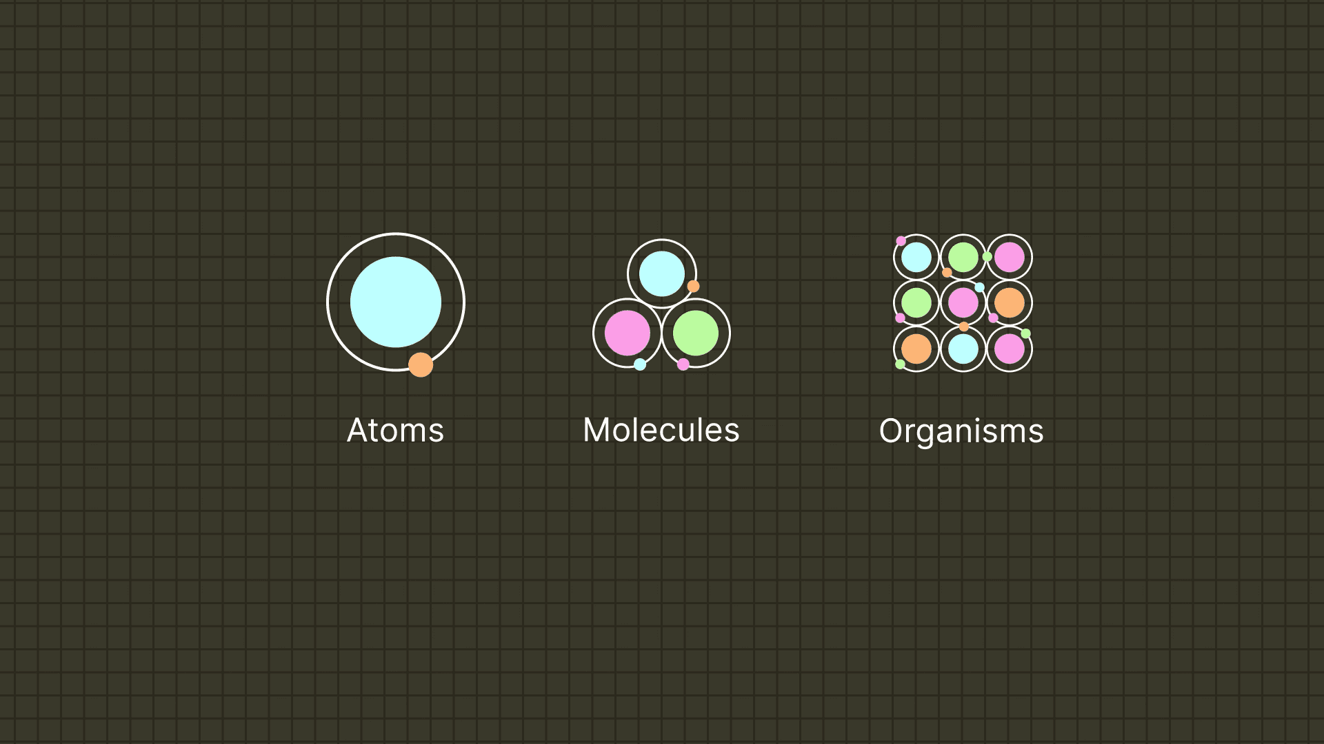
Atomic Design Principles
I was introduced to the idea of atomic design through Figma, who often organize their component libraries and guidelines using atomic principles. "Atoms are the basic building blocks of matter. In a design system, they represent elements that can’t be broken down any further without losing its function. Like an icon, input field, or button. Molecules are groups of two or more atoms that are bonded together. In a design system, they’re a collection of individual elements that together form a single unit. Like a search bar made up of an icon, input field, and button. Organisms are complex structures made up of molecules and atoms. Like a navigation menu that includes a search bar, along with a logo and other menu items." - Figma's Introduction to Design Systems: Build Your Design System
Organizational Plan
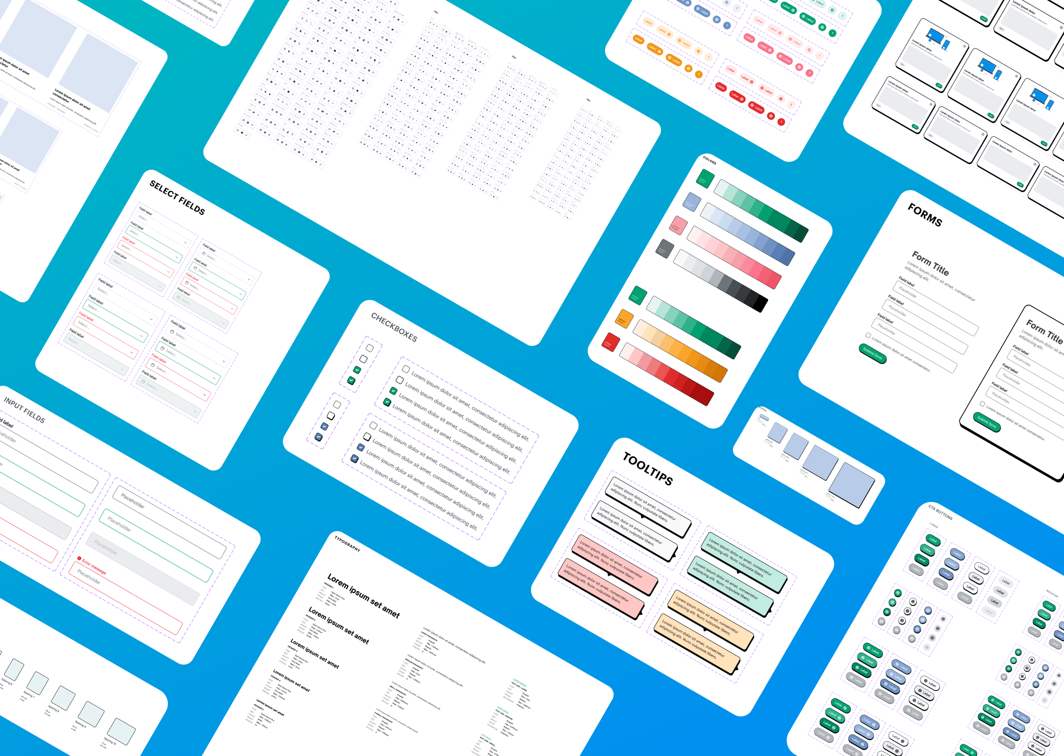
When laying out the organizational plan for the design system, I wanted to keep things neat without feeling too rigid. Inspired by the principles of atomic design, I structured the system into bite-sized components, like building blocks. This made it easy to find what I needed when putting together different parts of the blog. It's like having a well-organized toolbox – everything has its place, making it a breeze to create new pages or tweak existing ones. Plus, I made sure to document everything thoroughly, so anyone jumping in later to help with my blog could quickly get up to speed.
Layout
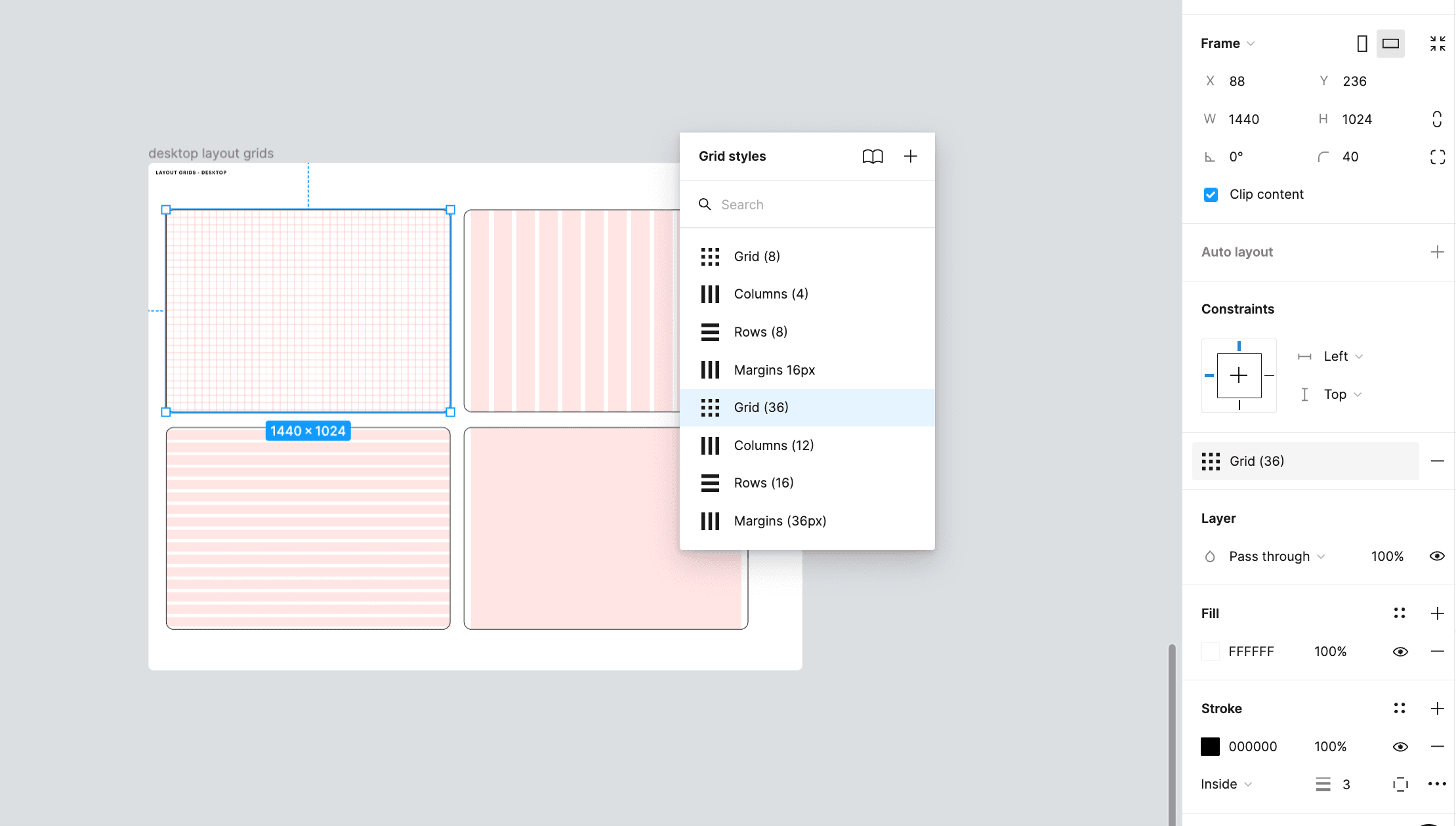
Delving into the layout of the site, I was drawn to a balance between flexibility and consistency. Just as I sought to create a blog that seamlessly adapts to the needs of its users, I established a grid system that flexes gracefully across devices. This process mirrored my own evolution, from tentative steps into the world of Webflow to confidently shaping the digital landscape of UXGems. The layout follows a 4-point structure and has desktop margins of 36px.
Color
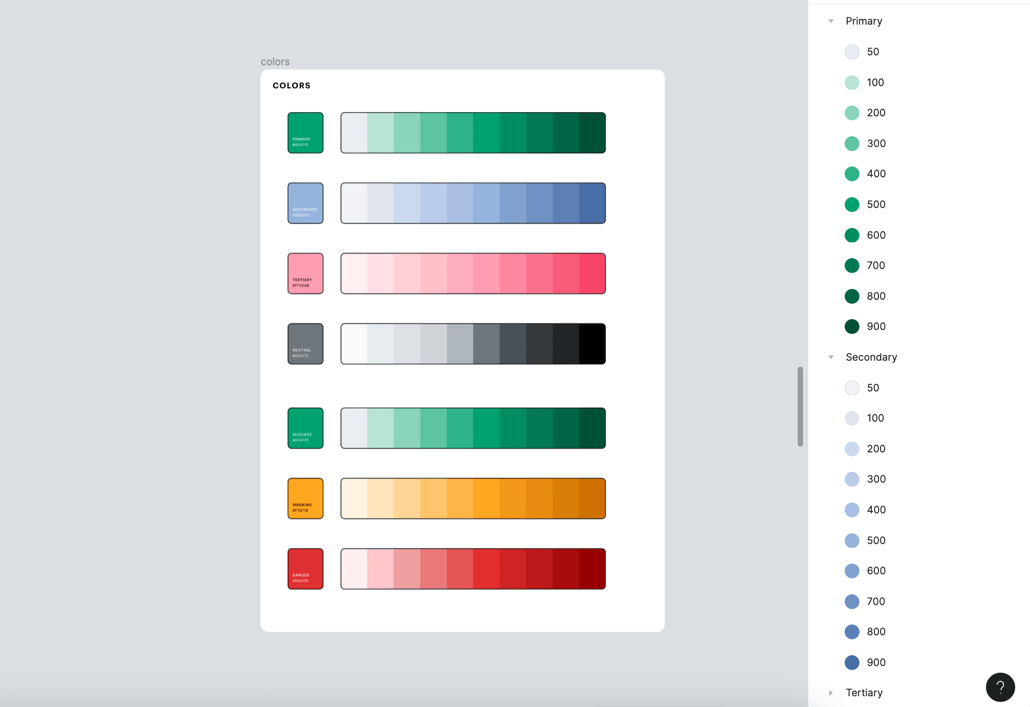
When it came to picking colors for the brand, I wanted to make sure they weren't just eye-catching but also worked together like a well-coordinated team. So, I took inspiration from Coolors, my go-to palette tool, to mix and match until I found a cohesive variation of brand colors. Primary Brand: #00A170 Secondary Brand: #96B3DE Tertiary Brand: #00A170
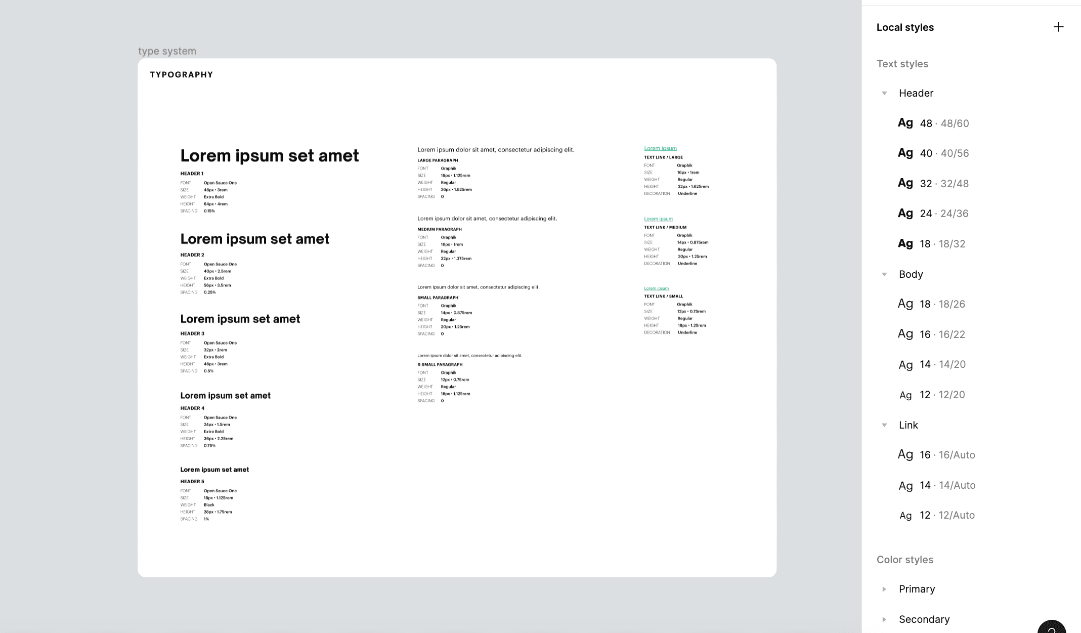
Type System
Typography plays a crucial role in setting the tone and readability of UXGems. For headers, I opted for Open Sauce One, giving them a bold and inviting presence that draws readers into each section. Meanwhile, for the body text, links, and buttons, I chose Graphik for its clean lines and easy legibility. This combination strikes a balance between personality and practicality, ensuring that content is not only visually appealing but also effortlessly navigable.
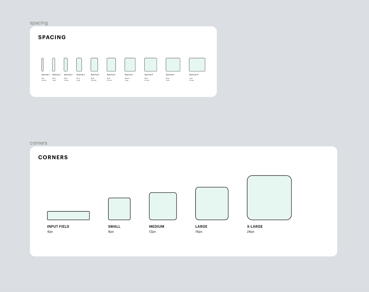
Spacing and Corners
To ensure visual cohesion throughout the blog, I also established a 4px scale for spacing, ranging from cozy 4 pixels all the way to 72px. This consistent rhythm ensures that elements breathe comfortably on the page, making for a more relaxed reading experience. As for border radius, using the 4px scale from a gentle curve to a more pronounced roundedness adds a touch of polish to every corner, making the design system feel not just visually cohesive, but also pleasantly tactile in its digital form.
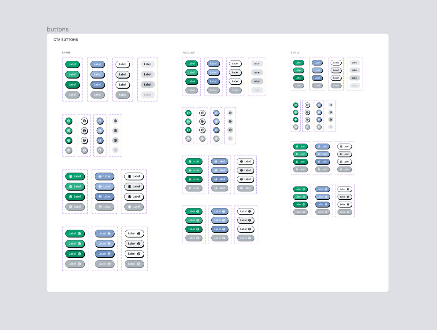
Buttons
To start building atom components, I designed CTA buttons that were organized into three categories based on size – large, medium, and small – ensuring they feel just right no matter where they appear on the page. Each category includes a palette of primary, secondary, and neutral fill colors that were chosen on the color system for accessible contrast. Each button has four different states: default, hover, pressed, and disabled. These buttons are always ready to respond to users' actions, whether it's a click, hover, or press.
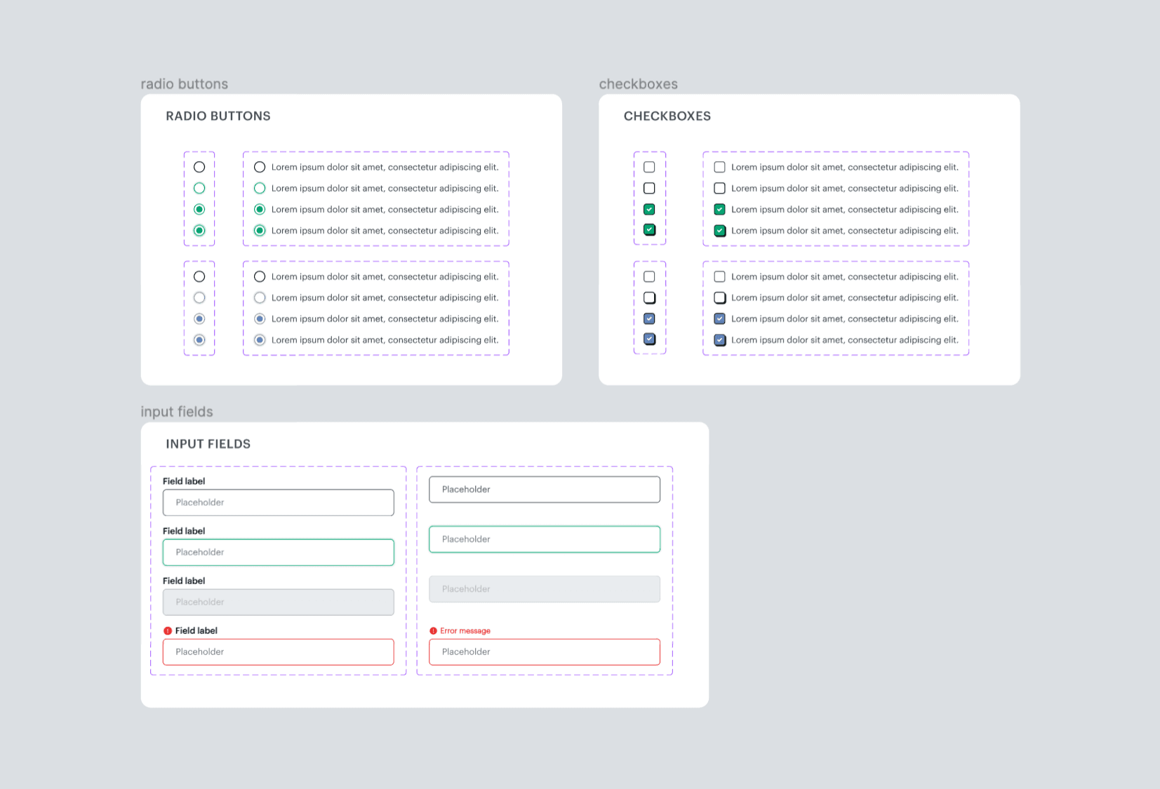
Form Elements
After creating a button system that felt consistent with the brand guidelines, I transitioned to form elements to utilize those same guidelines and continue developing a cohesive user experience. This step included checkboxes, radio buttons, and input fields, and each component needed a set of variables to account for the default, hover, pressed, and selected states. I included disabled states for the input fields, using the greyscale shades for reference, to set clear guidelines on fields that a user can't interact with.
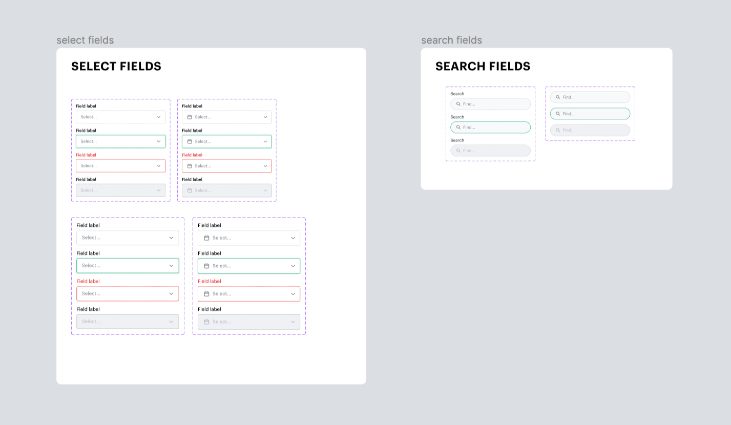
Select and Search
While the select and search fields were going to be functionally similar to the default input fields, the use of additional icons and input steps are what set these categories apart. I kept the same state design properties for each state so that the complete forms on the website would keep the consistent brand identity I needed to maintain. Like the simple input fields, this step needed components for 2 different sizes for a cohesive experience across different devices.
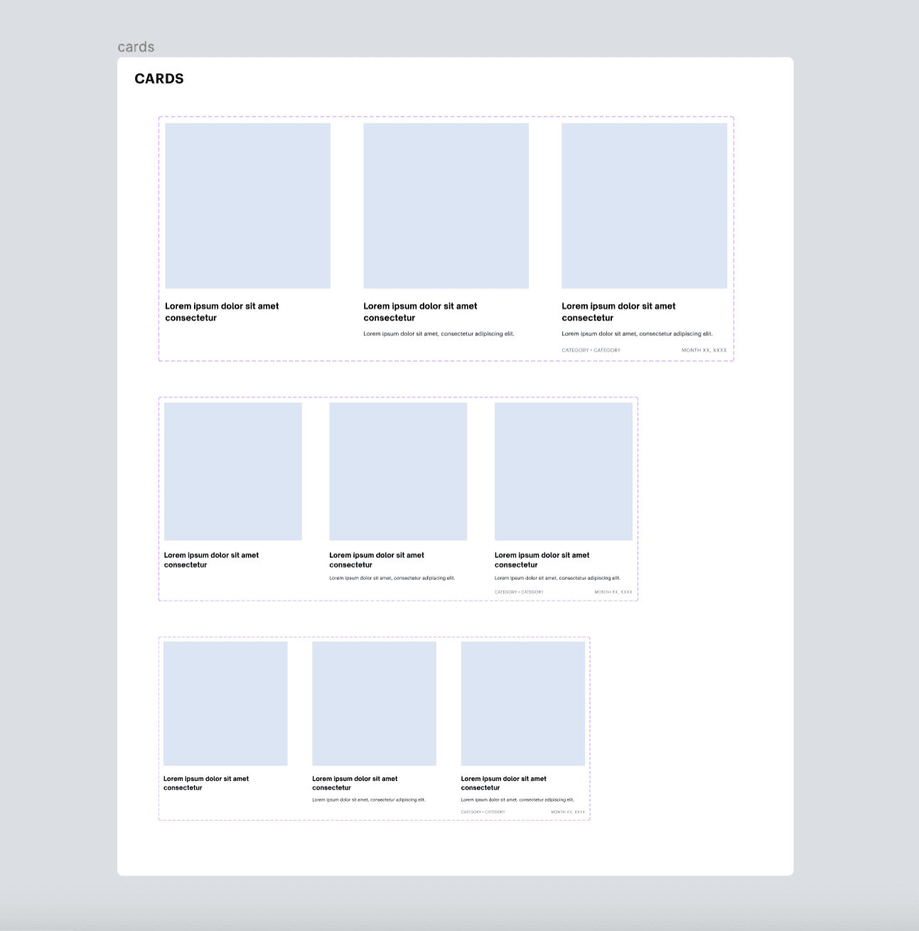
Cards
Once I'd finalized the form elements, I shifted my focus to the components that would appear much more frequently in the user experience: article cards and previews. Since this was a design system for a blog, I could safely assume that these were the components that users would be interacting with the most and would contribute to a visitor's overall impression when first exploring the blog. I wanted the card design to remain simple and straightforward, with clear visual hierarchy that prioritized the most important information for easy scanning. To get inspiration for ideal design choices, I studied Figma's own design system, which has been a great reference for me when building design guidelines. I've always found the UI of Figma's blog to be a standout example of clean and enjoyable design. After keeping notes of the design elements I liked from Figma's blog and other relevant sites like Uxcel, I came up with a simple product card design that felt organized and clear while fitting in with the existing elements. I chose sharp corners for the article thumbnail images, rather than the round borders of the buttons and input fields. I wanted to differentiate key components that users would interact with the most, since the buttons and other interactive elements had a more distinct appearance and would visually overwhelm the user if that appearance was overused. This also helped distinguish important CTA buttons from the rest of the user interface and would help users quickly locate the navigation points they needed to.
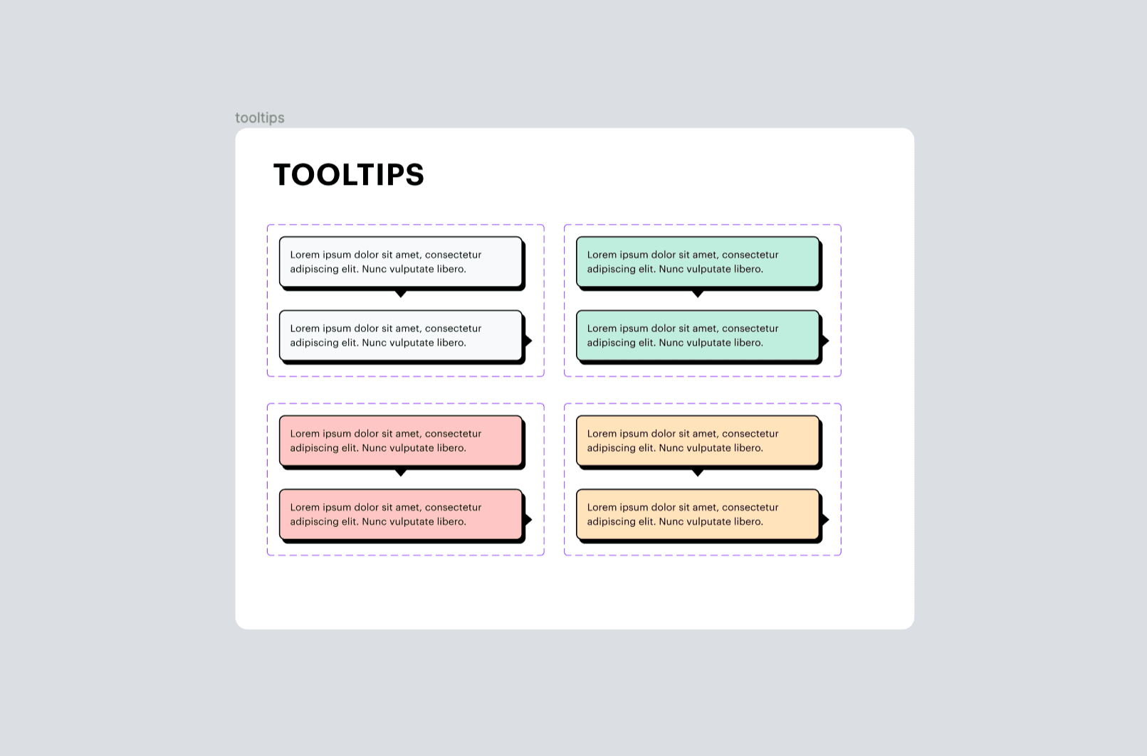
Tooltips
The tooltip components, unlike the blog cards, have the same bold, sharp shadow as CTAs and are colored according to the type of message being displayed: Primary Green for success notifications, Warning Yellow for alert, and Danger Red for error/failure. I chose to use the same distinct style of the buttons in order to draw the user's eye to tooltips that include important notifications, help messages, and clarifications. Some instances of tooltips I wanted to include in the final blog included account setup instructions, helpful pointers for bookmarking articles or sharing resources, and essential context for error and warning states.
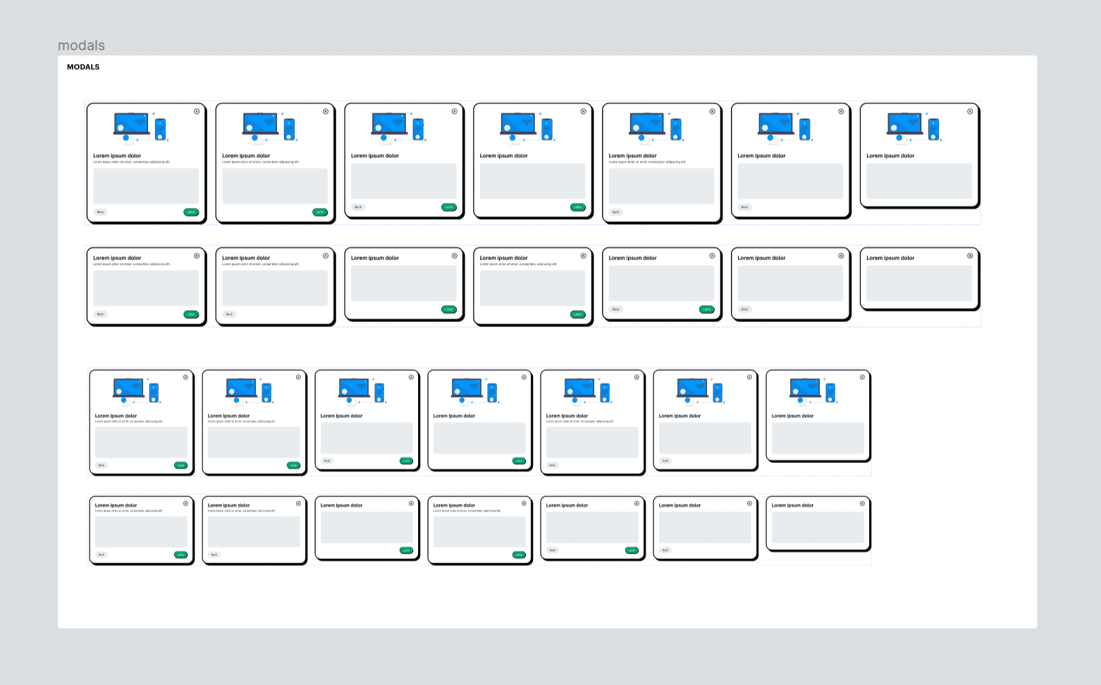
Modals
The modals, similar to the blog cards, are a large factor in the initial user experience. But since they would occur less often and contain important user actions, I once again used the same bold shadow and border I'd used for other important elements. The modals included in the final user experience will include login/signup, reporting a problem, resetting passwords, and newsletter CTAs. I designed the modal system to include several different types of overlays, since not all modals would need an image, back button, subtitle, etc. The only elements that remain consistent on every variable are the 'close' icon and the title of the modal.
Navigation
After designing the necessary molecule components for the blog, I moved on to the more complex items made up of multiple atoms and molecules. I started with the navbar design for desktop, tablet, and mobile screens: this, too, would be a vital part of the user experience. In order to communicate the brand's personality to the users as soon as possible, the navbars use the same style and are optimized for clear and seamless navigation. Since the blog won't be a familiar website to first-time users, I placed navbar elements according to what would feel most familiar. The brand logo, which will link to the homepage, always remains on the left side of the navbar regardless of device or orientation. 3 'quick links' are shown in the navbar as well, outside of the hamburger menu, and link to the most important pages in the blog. Once again following a familiar navigation layout, I set the 'log in' and 'sign up' CTAs on the right side of the navbar. I selected button components that direct attention to the 'sign up' button, which gives new users a visible and easy starting point. Returning users are more familiar with the site, so a neutral button is used to allow the primary button to stand out. When users are logged in to their account, a dropdown menu with their first name as the label appears instead of the buttons. The dropdown menu will include links to view saved articles, visit account settings, and log out.
Figma Community
This design system is also available on the Figma Community - click the link below to view the atomic design system in full. 🎨